

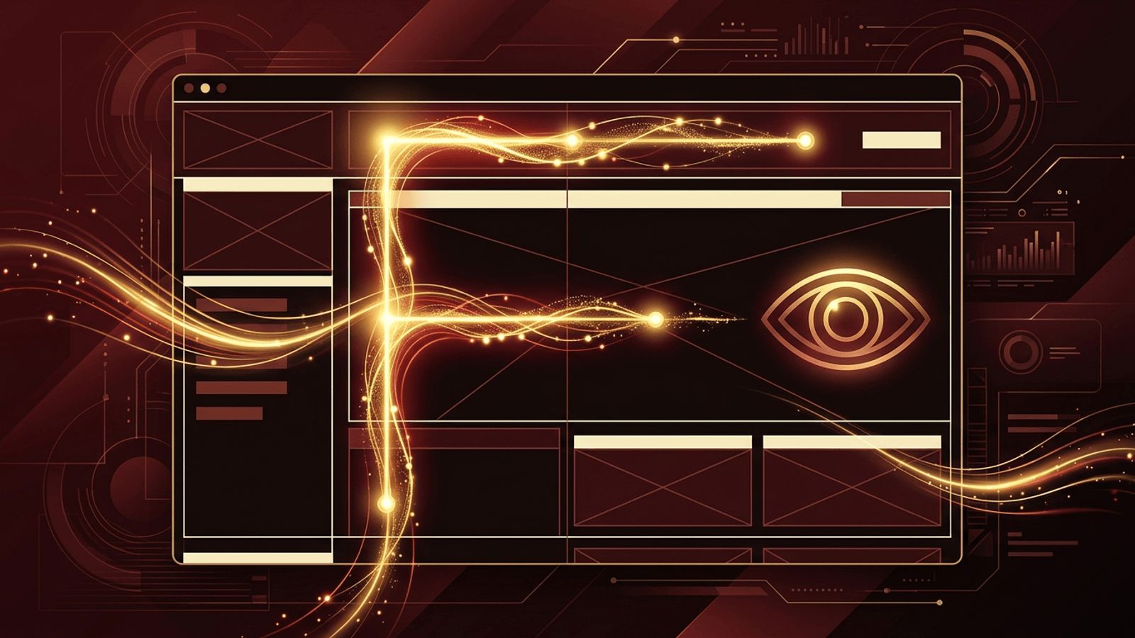
Online readers are busy, distracted, and impatient. Research in usability and eye tracking has consistently shown that people rarely read web pages from top to bottom, word for word. Instead, they scan, hunting for keywords, headings, and visual cues that tell them whether the page has what they need. Understanding how readers typically scan a web page is essential for designers, marketers, and content writers, because a page that cannot be scanned easily is a page that gets abandoned. This article explores the most common scanning patterns and practical ways to design content around them.
How AAMAX.CO Creates Scannable, High-Converting Pages
Designing pages that guide the eye naturally requires a combination of visual design, content strategy, and user research. AAMAX.CO is a full service digital marketing company offering web development, digital marketing, and SEO services worldwide, and they apply proven scanning principles to every layout they create. Their website design team structures headings, visuals, and calls to action so visitors find key information within seconds. By combining user-focused design with SEO-friendly content structure, they help businesses turn quick glances into meaningful engagement and conversions.
Why Readers Scan Instead of Read
People come to websites with goals: finding a price, comparing features, getting an answer, or locating contact details. Scanning lets them evaluate a page quickly and decide whether to invest more time. Screens also make sustained reading more tiring than print, and the abundance of alternative pages means users are always one click away from leaving. As a result, they skim first and read only when something catches their interest.
The F-Shaped Pattern
The F-pattern is the most famous scanning behavior, identified through eye-tracking studies of text-heavy pages. Readers first move horizontally across the top of the content area, forming the top bar of the F. Next, they move down a bit and read across a second, usually shorter, horizontal line. Finally, they scan vertically down the left side of the content, looking at the beginnings of lines and paragraphs. This means the first words of headings and paragraphs carry disproportionate weight, while content on the right side and lower parts of the page receives far less attention.
The Z-Shaped Pattern
On pages with less text and more visual elements, such as landing pages and homepages, readers often follow a Z-pattern. The eye starts at the top left, typically on the logo, moves across to the top right where navigation or a call to action sits, then cuts diagonally down to the bottom left, and finally sweeps across to the bottom right. Designers use this path by placing branding, key messages, and primary buttons along the Z for maximum visibility.
The Layer-Cake Pattern
When a page has clear, descriptive headings, readers often adopt a layer-cake pattern. Their eyes jump from heading to heading, skipping the body text in between until they find a section that matches their interest. This is one of the most efficient scanning behaviors and is encouraged by strong subheadings that summarize what each section contains.
The Spotted Pattern
Sometimes readers look for something specific, like a phone number, a date, a link, or a particular word. In this spotted pattern, they skip large chunks of content and fixate only on elements that look like what they are seeking. Formatting such as bold text, numbers, buttons, and distinct colors makes these targets easier to find.
The Commitment Pattern
Highly motivated readers who care deeply about a topic may read everything. This commitment pattern is more common when the content is highly relevant, such as a detailed guide the reader actively searched for. Even then, good structure helps them stay oriented and absorb information efficiently.
Designing Content for Scanning Behavior
Front-Load Important Information
Place the most critical words at the start of headings, paragraphs, and bullet points. Because readers scan the left edge, beginning sentences with meaningful keywords increases the chance they will be noticed.
Use Clear, Descriptive Headings
Headings should tell readers exactly what each section covers. Avoid clever but vague titles. Descriptive headings support the layer-cake pattern and also help search engines understand the structure of the page.
Keep Paragraphs Short
Large blocks of text are intimidating and easy to skip. Short paragraphs of two to four sentences create visual breathing room and make each idea easier to digest.
Use Lists and Visual Hierarchy
Bulleted and numbered lists, bold key phrases, and consistent typography help scanners extract value quickly. A clear visual hierarchy through size, weight, and color signals what matters most.
Place Calls to Action Strategically
Position buttons and links where the eye naturally lands, such as the end of a Z-pattern or near the left edge of an F-pattern. Use contrasting colors and action-oriented wording.
Support Text With Visuals
Images, icons, charts, and diagrams draw attention and can communicate concepts faster than words. Make sure visuals are relevant and placed near the text they support.
Mobile Scanning Differences
On mobile devices, the narrow screen produces more vertical scanning, and the first screen of content becomes even more important. Users scroll quickly, so short headings, compact paragraphs, and clear visual anchors help them stop at the right place. Tap-friendly buttons and sticky navigation also support fast decision-making.
Measuring How Your Visitors Scan
Tools like heatmaps, scroll maps, and session recordings reveal how real visitors interact with your pages. These insights show where attention drops off, which elements are ignored, and where users click. Regular testing helps refine layouts based on actual behavior instead of assumptions.
Conclusion
Readers typically scan web pages using patterns like the F-pattern, Z-pattern, layer-cake, and spotted approaches. By front-loading key information, using descriptive headings, keeping paragraphs short, and placing visuals and calls to action thoughtfully, you can design pages that work with natural reading habits rather than against them. The result is content that is easier to consume, more engaging, and more likely to convert.
