

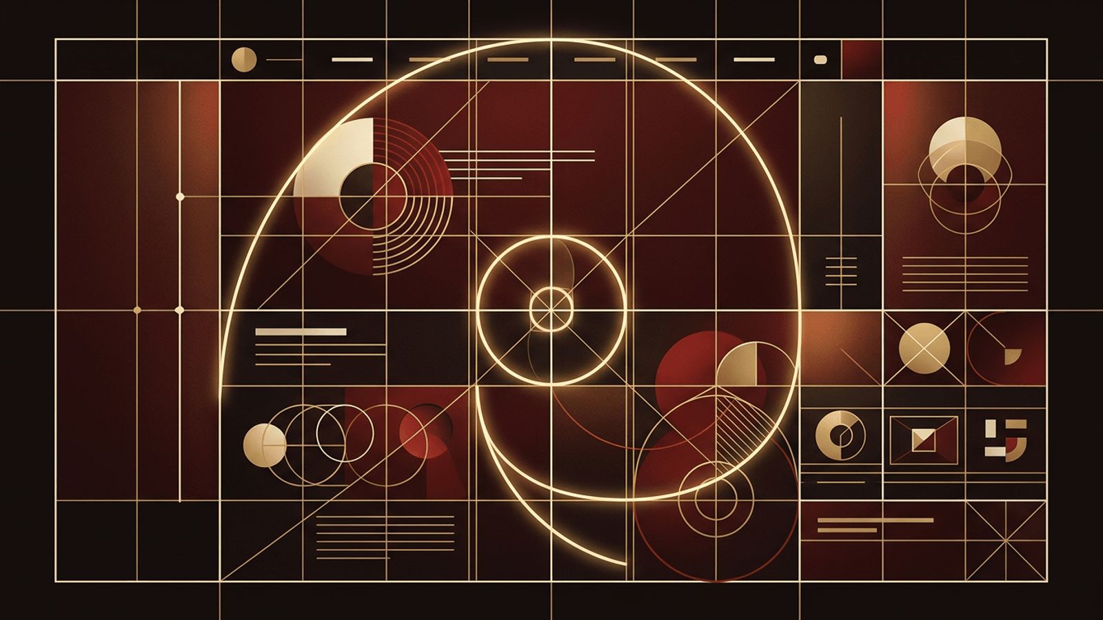
When people think about web design, they usually picture colors, images, and creative layouts rather than numbers and equations. Yet beneath every visually pleasing website lies a surprising amount of mathematics. Designers use proportions, grids, ratios, geometry, and even probability to create layouts that feel balanced, readable, and intuitive. Understanding how math is used in web design helps explain why some websites instantly feel right while others seem cluttered or awkward, even when it is hard to say exactly why.
How AAMAX.CO Applies Design Principles to Create Balanced Websites
Businesses that want websites with a polished, harmonious look can work with AAMAX.CO, a full-service digital marketing company offering web development, digital marketing, and SEO services worldwide. Their designers apply proven principles such as grid systems, consistent spacing scales, and typographic ratios to craft layouts that are both beautiful and functional. Because they combine design expertise with marketing strategy, they ensure visual structure supports user goals and conversions. Brands seeking professional website design can rely on them to translate these mathematical foundations into engaging digital experiences.
Grid Systems and Layout Structure
Grids are one of the most important mathematical tools in web design. A grid divides the page into columns and gutters, providing a framework for placing content consistently. The 12-column grid is especially popular because twelve divides evenly by two, three, four, and six, allowing designers to create a wide variety of layouts while maintaining alignment.
Using a grid ensures that elements line up across sections and pages, which creates a sense of order. Modern CSS tools such as CSS Grid and Flexbox make it easy for developers to implement these mathematical structures precisely, adapting columns as screen sizes change.
The Golden Ratio and Rule of Thirds
The golden ratio, approximately 1.618, has been used in art and architecture for centuries because proportions based on it are often perceived as naturally pleasing. In web design, it can guide the relationship between content areas and sidebars, the proportions of images, or the scale between heading and body text sizes.
The rule of thirds, borrowed from photography, divides a space into a three-by-three grid. Placing key elements such as headlines, calls to action, or focal points of hero images along these lines or at their intersections tends to create more dynamic and engaging compositions.
Typographic Scales and Line Height
Typography relies heavily on math. Designers often use modular scales, where each font size is a multiple of a base size using a consistent ratio such as 1.25 or 1.333. This creates a harmonious hierarchy from small captions to large headlines.
Line height, line length, and letter spacing are also calculated. Body text typically reads best with a line height around 1.5 times the font size and a line length of roughly 50 to 75 characters. These measurements are grounded in readability research and help visitors consume content comfortably.
Spacing Systems and Visual Rhythm
Consistent spacing is a hallmark of professional design. Many design systems use a base unit, often 4 or 8 pixels, and build all margins and padding from multiples of that unit. This mathematical consistency creates visual rhythm, making layouts feel cohesive and intentional.
When spacing is random, pages look disorganized even if individual elements are attractive. A simple spacing scale removes guesswork and makes collaboration between designers and developers more efficient.
Geometry, Shapes, and Visual Balance
Geometry influences everything from button shapes to icon design. Circles often feel friendly and approachable, squares feel stable, and triangles imply direction or movement. Designers balance visual weight by considering the size, color, and position of elements, almost like balancing objects on a scale.
Symmetrical layouts convey stability and formality, while asymmetrical layouts create energy and interest. Both rely on an intuitive understanding of geometric balance that is rooted in mathematical relationships.
Color Theory and Mathematical Relationships
Color theory is closely tied to math. Colors are defined using numerical models such as RGB, HSL, and OKLCH. Complementary, analogous, and triadic color schemes are based on angular relationships on the color wheel, such as colors positioned 180 or 120 degrees apart.
Accessibility guidelines also use math to measure color contrast. The Web Content Accessibility Guidelines specify minimum contrast ratios, such as 4.5 to 1 for normal text, to ensure readability for users with visual impairments. Designers use calculators to confirm their color choices meet these standards.
Responsive Design and Proportional Units
Responsive design depends on proportional thinking. Designers and developers use percentages, viewport units, and relative units like rem and em so layouts adapt smoothly across devices. Fluid typography often uses mathematical functions such as CSS clamp to scale text between minimum and maximum sizes based on screen width.
Breakpoints, aspect ratios for images and video, and flexible grid fractions all require calculations to maintain consistency and avoid awkward layouts on different screens.
Data, Testing, and Design Decisions
Math also guides design decisions through data analysis. A/B testing compares two versions of a page and uses statistical significance to determine which performs better. Heatmaps, click-through rates, and conversion percentages help designers understand how users interact with layouts and where improvements are needed. This evidence-based approach turns design from guesswork into a measurable process.
Conclusion
Math is used in web design to create structure, harmony, readability, and accessibility. Grid systems, the golden ratio, typographic scales, spacing units, color models, and statistical testing all contribute to websites that look attractive and work effectively. Even if visitors never notice these calculations, they feel the results in layouts that are balanced, intuitive, and enjoyable to use. Great design is creative, but it is also deeply mathematical.
