

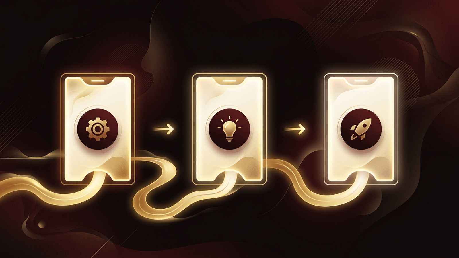
Visitors arrive on a website with questions. What does this company do? How does the service work? What happens after I sign up? A How It Works section answers these questions quickly by breaking a process into a few clear, digestible steps. When designed well, this section reduces confusion, builds trust, and moves visitors closer to taking action. This guide explores why the How It Works section matters in web design, what it should include, and how to design one that genuinely improves conversions.
How AAMAX.CO Designs Conversion-Focused Website Sections
Businesses that want every section of their website to work toward conversions can partner with AAMAX.CO, a full-service digital marketing company offering web development, digital marketing, and SEO services worldwide. Their designers craft How It Works sections that simplify complex offerings into clear visual journeys, using thoughtful layouts, icons, and copy aligned with user intent. Because they combine design with marketing insight, they ensure each step guides visitors toward meaningful action. Companies seeking strategic website design can rely on them to create pages that inform and persuade.
What Is a How It Works Section
A How It Works section is a part of a web page, often on the homepage or a product page, that explains a process in a sequence of steps. Typically it contains three to five steps, each with a short title, a brief description, and a supporting visual such as an icon, illustration, or screenshot. The goal is to show users that getting started is simple and to set clear expectations about what will happen.
Why This Section Matters
People are more likely to take action when they understand what is involved. Uncertainty creates hesitation, and hesitation leads to abandoned visits. A How It Works section reduces perceived effort and risk by making the process transparent. It is particularly valuable for services, SaaS products, marketplaces, subscription businesses, and any offering that is new or unfamiliar to the audience.
This section also supports SEO and accessibility when written with clear headings and descriptive text, helping search engines understand the service and helping all users follow the information.
Keep the Number of Steps Small
Simplicity is the core principle. Three steps is a popular choice because it feels quick and achievable. Four or five steps can work for more complex processes, but anything beyond that may overwhelm users. If a process genuinely involves many steps, group them into broader stages and link to a detailed page for those who want more information.
Write Clear, Action-Oriented Copy
Each step should have a concise title that starts with a verb, such as Choose a Plan, Customize Your Order, or Get Results. Descriptions should be one or two sentences explaining what happens and what benefit the user receives. Avoid jargon and focus on the user's perspective rather than internal processes.
Use Visuals to Reinforce Each Step
Icons, illustrations, and product screenshots make steps easier to understand at a glance. Consistent visual style is important; all icons should share the same line weight, color palette, and level of detail. Product screenshots work especially well for software, showing users exactly what they will see. Numbered markers or a connecting line between steps help communicate sequence and progress.
Choose the Right Layout
Horizontal layouts, where steps are displayed side by side, work well on desktop and create a clear left-to-right flow. On mobile, these typically stack vertically. Vertical timelines are effective for longer processes or when each step needs more explanation. Alternating layouts, with text and images switching sides, add visual interest for detailed walkthroughs.
Whatever layout is chosen, it must be responsive. Steps should remain readable and properly ordered on every screen size.
Add Subtle Motion and Interactivity
Animations can make a How It Works section more engaging, such as steps fading in as users scroll or a progress line drawing between them. Interactive tabs or carousels can show deeper detail for each step. However, motion should be subtle and purposeful, and developers should respect users' reduced motion preferences for accessibility.
Include a Clear Call to Action
After explaining the process, guide users toward the next step. Place a prominent call-to-action button at the end of the section, such as Get Started, Book a Consultation, or Start Your Free Trial. This turns understanding into action while motivation is high.
Position the Section Strategically
On most homepages, the How It Works section appears after the hero area and value proposition but before pricing or testimonials. This order introduces the offer, explains how it works, then builds trust and prompts conversion. On landing pages, it can appear near the top if the process is a key selling point.
Common Mistakes to Avoid
Common mistakes include using too many steps, writing vague descriptions, choosing inconsistent or decorative visuals that add no meaning, and forgetting the call to action. Another mistake is focusing on the company's internal process instead of what the customer experiences. Testing the section with real users can reveal confusing elements quickly.
Measuring Effectiveness
Analytics tools, scroll tracking, and heatmaps show whether visitors view and interact with the section. A/B testing different layouts, step counts, or copy can reveal which version drives more conversions. Continuous refinement ensures the section remains effective as the offering evolves.
Conclusion
A How It Works section in web design transforms complex offerings into simple, visual steps that build confidence and encourage action. By keeping steps few, writing clear copy, using consistent visuals, designing responsively, and ending with a strong call to action, businesses can turn curious visitors into customers. It is a small section with a big impact on user experience and conversion rates.
