

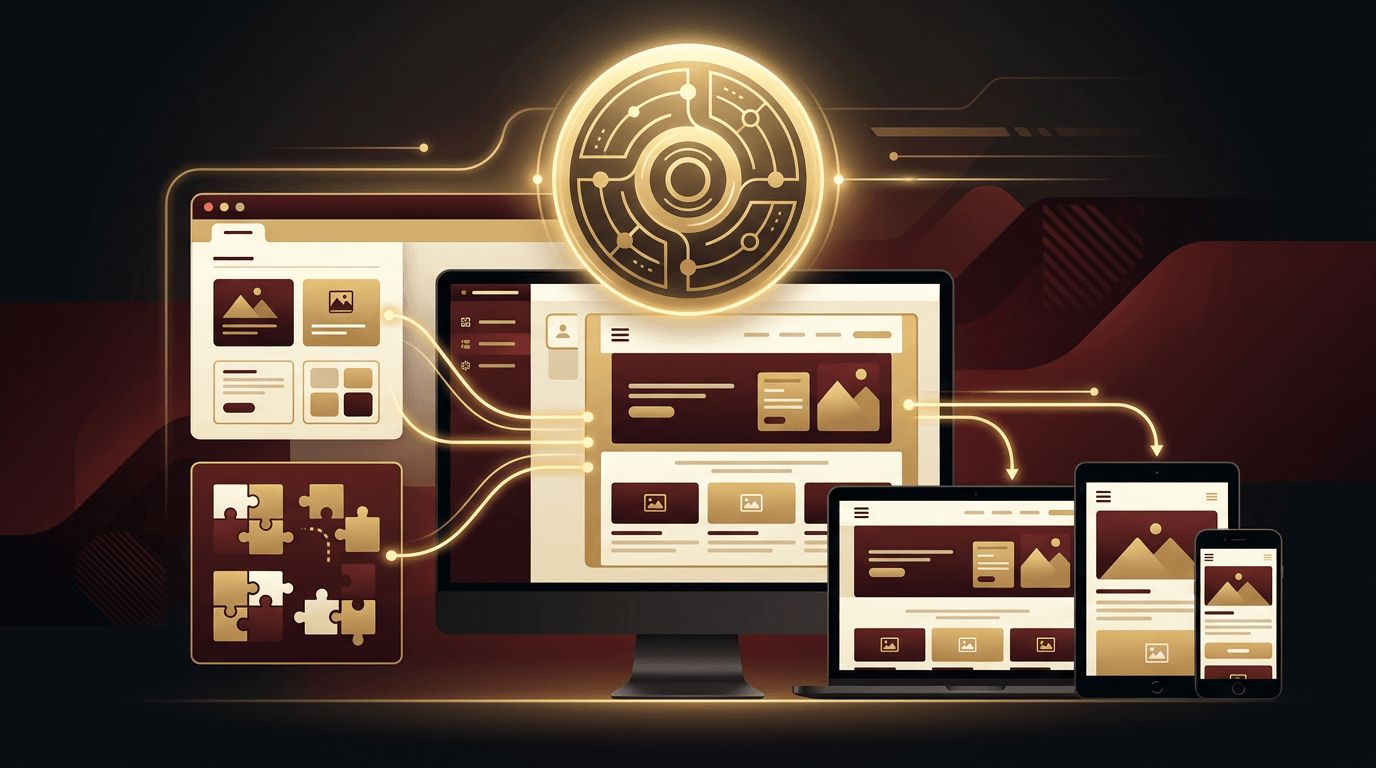
WordPress powers a significant portion of all websites, from personal blogs to large corporate sites and online stores. With so many visitors browsing on smartphones and tablets, making your WordPress site responsive is no longer optional; it directly affects user experience, conversions, and search rankings. Fortunately, WordPress offers many tools to create responsive designs, whether you prefer themes, the block editor, page builders, or custom code. In this guide you will learn how to create responsive web design in WordPress step by step.
Get a Fully Responsive WordPress Site with AAMAX.CO
Making WordPress look great on every device involves choosing the right theme, configuring layouts carefully, and optimizing performance. AAMAX.CO is a full service digital marketing company that offers web development, digital marketing, and SEO services worldwide. Their WordPress specialists build custom themes, configure block-based and page builder layouts, and optimize sites for speed and mobile usability. Whether you need a new responsive WordPress site or want to fix an outdated one, they deliver results that look polished and rank well.
Step 1: Choose a Responsive Theme
The theme is the foundation of your site's responsiveness. Most modern themes are responsive by default, but quality varies. Look for:
- Lightweight code and fast loading times.
- Full Site Editing (block theme) support or strong page builder compatibility.
- Responsive controls for typography, spacing, and layout.
- Regular updates and good reviews.
- Accessibility-ready features.
Popular choices include block themes like Twenty Twenty-Five and Ollie, and lightweight multipurpose themes such as Astra, GeneratePress, Kadence, and Blocksy. Preview themes on your phone before installing them.
Step 2: Use the Block Editor's Responsive Features
The WordPress block editor (Gutenberg) includes responsive behavior built in. Columns blocks stack vertically on mobile automatically, and you can toggle "Stack on mobile" in the block settings. Use these blocks to create flexible layouts:
- Group, Row, and Stack blocks for flexible containers using Flexbox.
- Grid layout for responsive card and gallery arrangements.
- Cover blocks with focal point controls so hero images crop nicely on small screens.
- Fluid typography settings in theme.json for text that scales smoothly.
Use the device preview options in the editor toolbar to check desktop, tablet, and mobile views as you build.
Step 3: Configure Global Styles with theme.json
Block themes use a theme.json file to define global design settings. You can enable fluid typography and set responsive spacing scales:
{ "settings": { "typography": { "fluid": true, "fontSizes": [ { "slug": "large", "size": "2rem", "fluid": { "min": "1.5rem", "max": "2.5rem" } } ] }, "layout": { "contentSize": "720px", "wideSize": "1200px" } }}These settings apply consistently across your site, reducing the need for manual adjustments on each page.
Step 4: Use a Page Builder with Responsive Controls
Page builders like Elementor, Beaver Builder, Bricks, and Spectra provide visual editing with device-specific settings. You can adjust font sizes, padding, margins, column widths, and visibility separately for desktop, tablet, and mobile. Best practices include:
- Design the desktop layout, then refine tablet and mobile views individually.
- Reduce padding and font sizes on smaller screens.
- Reorder columns so important content appears first on mobile.
- Hide non-essential decorative elements on small screens to keep pages fast.
Step 5: Add Custom CSS for Fine-Tuning
Sometimes you need precise control. Add custom CSS through the Site Editor's Additional CSS panel, the Customizer, or a child theme stylesheet:
@media (max-width: 767px) { .site-header .menu { font-size: 1rem; } .hero-section { padding: 3rem 1rem; }}Using a child theme ensures your customizations survive theme updates.
Step 6: Create a Mobile-Friendly Navigation Menu
Navigation is often the biggest challenge on small screens. Block themes include a Navigation block with an overlay menu option for mobile devices. Keep menus short, use clear labels, and ensure the menu toggle is large and easy to tap. Consider a sticky header so navigation remains accessible as users scroll.
Step 7: Optimize Images for Every Device
WordPress automatically generates multiple image sizes and outputs srcset attributes, allowing browsers to choose the best size. Enhance this with an image optimization plugin that compresses images and converts them to WebP or AVIF. Enable lazy loading, which WordPress includes by default, for images below the fold.
Step 8: Improve Mobile Performance
Responsive design is not just about layout; speed matters too. Install a caching plugin, minify CSS and JavaScript, limit the number of plugins, and use a content delivery network. Choose quality hosting optimized for WordPress. Monitor Core Web Vitals in Google Search Console to identify mobile performance issues.
Step 9: Make Forms and Tables Responsive
Contact forms should use full-width fields and large buttons on mobile. Wide tables can break layouts on small screens, so use responsive table plugins or wrap tables in a horizontally scrollable container. For e-commerce sites, test product pages, cart, and checkout flows thoroughly on phones.
Step 10: Test Across Devices
Preview your site on real devices, test multiple browsers, and use Chrome DevTools device emulation. Check headers, menus, images, buttons, forms, and footers at every breakpoint. Run Lighthouse audits for mobile usability and accessibility. Thoughtful website design ensures each breakpoint feels intentional.
When to Consider a Custom WordPress Theme
If off-the-shelf themes and page builders feel limiting or slow, a custom theme built specifically for your brand delivers cleaner code, faster performance, and precise responsive behavior. Professional website development creates bespoke WordPress themes and block libraries tailored to your content and goals. For advanced functionality such as membership portals or custom dashboards, web application development can extend WordPress beyond its standard capabilities.
Conclusion
Creating responsive web design in WordPress starts with a quality responsive theme and continues with the block editor's flexible layouts, global styles in theme.json, page builder device controls, and targeted custom CSS. Optimize navigation, images, forms, and performance for mobile users, and test thoroughly on real devices. With these steps, your WordPress site will provide a consistent, engaging experience on every screen.
