

Introduction
User interface design shapes how people see and interact with websites and web applications. Every button, menu, form, and card contributes to an experience that either feels effortless or frustrating. Great web UI combines aesthetics with usability, guiding users toward their goals while reflecting a brand's personality. If you want to learn how to design web UI that looks polished and works intuitively, this guide covers the essential principles, elements, and practices that professional designers use every day.
Elevate Your Web Interface With AAMAX.CO
A beautiful, intuitive interface can set a brand apart and improve conversion rates, but achieving it requires expertise in visual design and user behavior. AAMAX.CO is a full service digital marketing company providing web development, digital marketing, and SEO services worldwide. Their designers create modern, accessible interfaces tailored to each brand and audience. With their website design services, they deliver UI that is visually striking, consistent across pages, and built to help users accomplish their goals with ease.
UI Versus UX
User interface design focuses on the visual and interactive elements users see and touch, such as layouts, typography, colors, and controls. User experience design is broader, covering research, user flows, and the overall journey. Strong UI depends on good UX foundations, and great UX needs thoughtful UI to come to life. Understanding this relationship helps you design interfaces that are both beautiful and purposeful.
Core Principles of Web UI Design
Several principles guide effective UI design.
- Clarity: Users should immediately understand what each element is and what it does.
- Consistency: Similar elements should look and behave the same throughout the interface.
- Hierarchy: Visual emphasis should reflect importance.
- Feedback: The interface should respond to every user action.
- Simplicity: Remove anything that does not support the user's goals.
Establish Visual Hierarchy
Visual hierarchy helps users scan interfaces quickly and focus on what matters. Use size to signal importance, with larger elements attracting attention first. Use color and contrast to highlight primary actions. Group related elements together and separate unrelated ones with spacing. A clear hierarchy reduces cognitive effort and speeds decision-making.
Use Grids and Spacing Systems
Grids bring structure and alignment to layouts. A 12-column grid offers flexibility for many arrangements on desktop, while fewer columns suit mobile screens. Combine grids with a consistent spacing scale, often based on multiples of four or eight pixels. Consistent spacing creates rhythm and makes interfaces feel polished and professional.
Choose Typography Thoughtfully
Typography carries most of the content in any interface. Choose legible typefaces and establish a clear type scale for headings, subheadings, body text, and captions. Maintain comfortable line height and line length. Use font weight and size rather than many different fonts to create contrast. Limiting typefaces to one or two keeps the interface cohesive.
Build a Color System
A color system includes primary and secondary brand colors, neutral shades for backgrounds and text, and semantic colors for success, warning, error, and information messages. Define tints and shades for each color to support different states and backgrounds. Always check contrast ratios to ensure text and controls are readable for users with visual impairments. Never rely on color alone to convey meaning.
Design Consistent Components
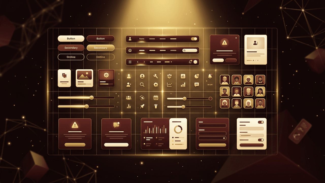
Components are reusable building blocks such as buttons, inputs, dropdowns, checkboxes, cards, navigation bars, tabs, modals, and alerts. Design each component with clear purpose and consistent styling. Create variations for different sizes and contexts, and document usage guidelines. A strong component library speeds up design and development while maintaining consistency.
Define Interaction States
Interactive elements need visual states that communicate their status. Buttons and links should have default, hover, focus, active, and disabled states. Form inputs need states for focus, error, and success. Clear states tell users what is clickable, what is selected, and what requires attention. Visible focus states are especially important for keyboard users.
Add Microinteractions
Microinteractions are small animations or responses that occur when users interact with the interface, such as a button changing shape when pressed, a heart icon animating when liked, or a toggle sliding smoothly. These details provide feedback, make interfaces feel alive, and add personality. Keep them subtle, quick, and purposeful.
Design for Accessibility
Accessible UI ensures everyone can use your interface, including people with disabilities. Provide sufficient contrast, readable text sizes, descriptive labels, visible focus indicators, and touch targets large enough for easy interaction. Design layouts that work with screen readers and keyboard navigation. Accessibility improvements often benefit all users.
Make UI Responsive
Web interfaces must adapt to many screen sizes. Design components that flex, stack, or reorganize gracefully. Simplify navigation on small screens and prioritize essential content. Test designs on real devices to confirm usability.
Create and Maintain a Design System
A design system combines design tokens, components, patterns, and guidelines into a single source of truth. It aligns designers and developers, ensures consistency across products, and makes scaling easier. Treat the design system as a living product that evolves with user needs and brand changes.
Conclusion
Learning how to design web UI involves mastering clarity, consistency, hierarchy, and feedback, along with practical skills in grids, typography, color, components, interaction states, microinteractions, accessibility, and responsiveness. When applied together, these principles create interfaces that users find intuitive and enjoyable. If you want a polished, conversion-focused interface for your website or application, AAMAX.CO can design a UI that elevates your brand and delights your users.
