

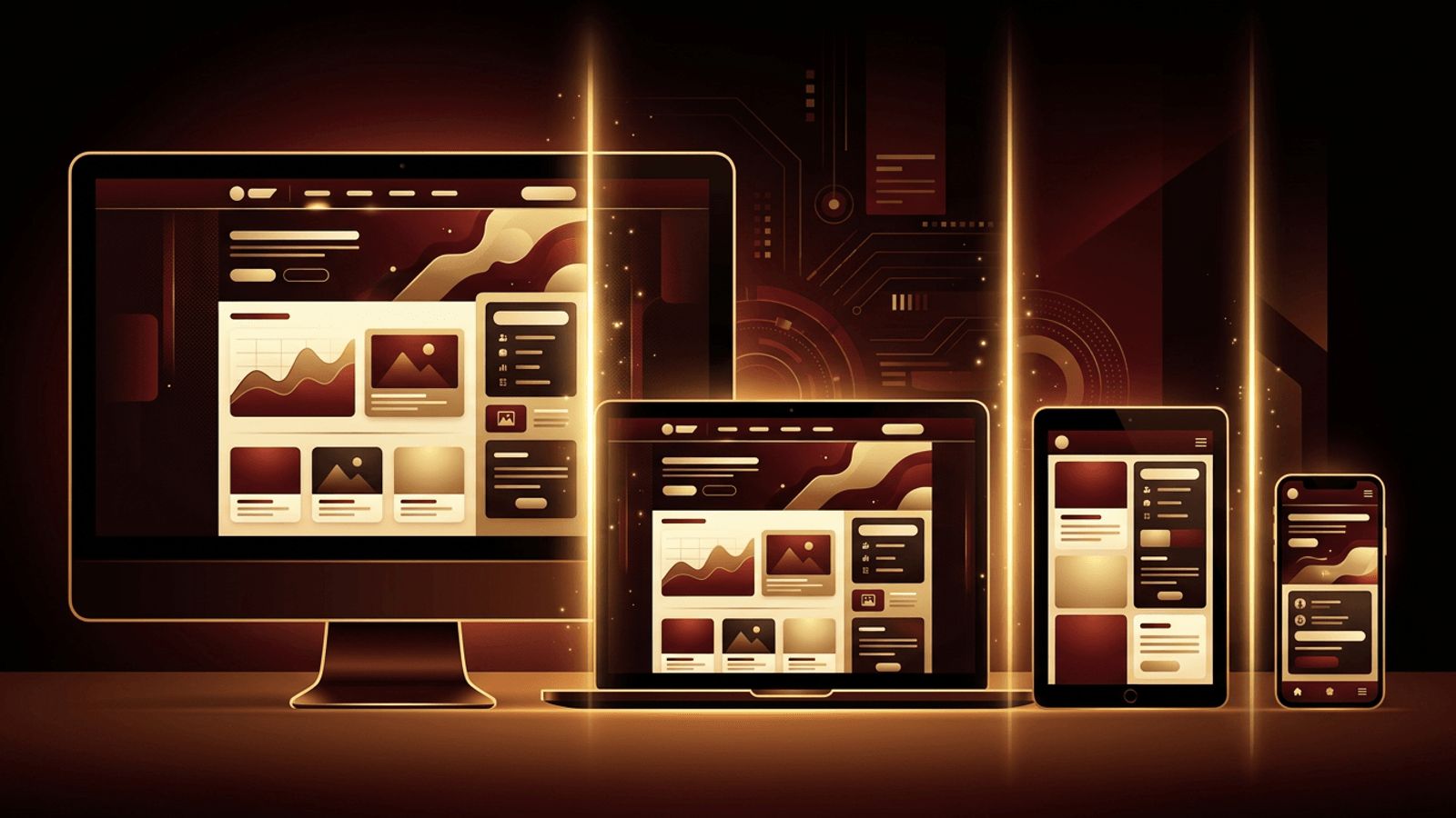
People visit websites on phones, tablets, laptops, large monitors, and even televisions. A layout that looks perfect on one screen can be unusable on another. Responsive web design solves this by allowing layouts to adapt to their environment, and CSS media queries are one of its core tools. Learning how to use media queries for responsive web design ensures your website delivers a great experience to every visitor, regardless of device.
This guide explains media query syntax, breakpoint strategies, mobile-first development, targeting user preferences, modern features such as range syntax and container queries, and best practices for testing.
Responsive Websites That Perform, Built by AAMAX.CO
A website that works beautifully on every device is essential for engagement and search rankings. AAMAX.CO is a full-service digital marketing company offering web development, digital marketing, and SEO services worldwide. Their designers and developers craft mobile-first, responsive websites that adapt seamlessly to any screen while remaining fast and accessible. Businesses seeking a modern, device-friendly presence can rely on their website development team to deliver consistent experiences across all platforms.
What Are Media Queries?
Media queries are CSS rules that apply styles only when certain conditions are true, such as the viewport width, screen orientation, resolution, or user preferences. They allow a single stylesheet to adapt layouts, typography, spacing, and visibility based on the device and context.
Understanding Media Query Syntax
A media query begins with the at-media rule, followed by an optional media type, such as screen or print, and one or more media features in parentheses. For example, a query with min-width set to 768 pixels applies its styles only when the viewport is at least 768 pixels wide. You can combine conditions with and, separate alternatives with commas, and negate queries with not.
Inside the query, you write normal CSS rules. When the condition is met, those rules override or extend the base styles.
Do Not Forget the Viewport Meta Tag
For media queries to work correctly on mobile devices, include the viewport meta tag in the head of your HTML, setting width to device-width and initial-scale to 1. Without it, mobile browsers may render the page at a desktop width and scale it down, making your media queries ineffective.
Adopting a Mobile-First Approach
Mobile-first design means writing base styles for small screens, then using min-width media queries to enhance layouts as screens get larger. This approach has several advantages:
- It prioritizes essential content and performance for mobile users.
- Base styles stay simpler, with complexity added only when space allows.
- It aligns with how search engines index sites using mobile-first indexing.
The alternative, desktop-first design, uses max-width queries to scale layouts down, but it often leads to more overrides and heavier CSS for mobile devices.
Choosing Breakpoints
Breakpoints are the widths at which your layout changes. Common starting points include around 640 pixels for large phones, 768 pixels for tablets, 1024 pixels for small laptops, and 1280 pixels or more for desktops. However, the best practice is to choose breakpoints based on your content rather than specific devices. Resize your browser and add a breakpoint wherever the layout starts to look awkward, such as when lines of text become too long or columns become too narrow.
Common Responsive Adjustments
Media queries are typically used to:
- Change grid layouts from one column to multiple columns.
- Switch navigation from a hamburger menu to a horizontal bar.
- Adjust font sizes, line heights, and spacing.
- Show or hide secondary content.
- Resize or swap images for different screens.
Using Modern Range Syntax
Modern browsers support a cleaner range syntax for media queries. Instead of writing min-width and max-width separately, you can express conditions using comparison operators, such as width greater than or equal to 768 pixels. This makes queries more readable, especially when targeting ranges between two breakpoints.
Targeting User Preferences
Media queries are not just about screen size. They can also respond to user settings:
- prefers-color-scheme detects whether users prefer light or dark mode, allowing you to provide matching themes.
- prefers-reduced-motion identifies users who want minimal animation, helping you create more accessible experiences.
- prefers-contrast supports users who need higher contrast.
- hover and pointer features detect whether a device supports hovering or uses touch, letting you adjust interactions.
Print Styles
Using the print media type, you can create printer-friendly versions of pages by hiding navigation, ads, and decorative elements, adjusting colors for ink efficiency, and showing full link URLs. This is valuable for recipes, invoices, articles, and documentation.
Container Queries: The Next Step
Media queries respond to the viewport, but components often need to respond to the size of their container. Container queries, now supported in modern browsers, allow a card or widget to change its layout based on the space available in its parent element. Combining media queries for page-level layout and container queries for component-level behavior creates truly flexible designs.
Fluid Techniques That Reduce Breakpoints
Not every adjustment needs a media query. CSS functions like clamp, min, and max create fluid typography and spacing that scale smoothly between sizes. CSS Grid features such as auto-fit and minmax automatically adjust the number of columns. Using these techniques alongside media queries results in cleaner, more resilient code.
Testing Responsive Designs
Use browser developer tools to simulate different devices and screen sizes, but also test on real phones and tablets. Check touch targets, readability, image quality, and performance on slower networks. Tools like Google Lighthouse can highlight mobile usability issues.
Conclusion
Learning how to use media queries for responsive web design empowers you to build websites that adapt gracefully to any device and user preference. By mastering syntax, adopting a mobile-first approach, choosing content-driven breakpoints, responding to user preferences, and combining media queries with container queries and fluid techniques, you can create flexible, accessible experiences that delight visitors everywhere.
