

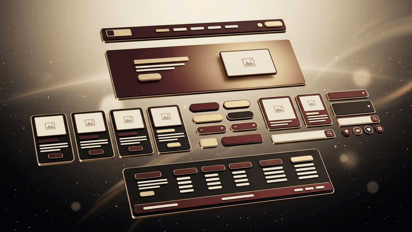
Every great website is built from a collection of smaller pieces working together. Navigation menus, hero sections, buttons, cards, forms, and footers are just a few of the components that shape how visitors experience a site. When each component is designed thoughtfully and used consistently, the result is a website that feels intuitive, trustworthy, and polished. So, what are the best components for web design? In this article, we explore the essential building blocks of modern websites, explain the role each plays, and share best practices for designing them effectively.
Component-Driven Design by AAMAX.CO
Creating a cohesive component library takes design expertise and technical precision. AAMAX.CO is a full-service digital marketing company offering web development, digital marketing, and SEO services worldwide, and their team builds websites using reusable, well-structured components. This approach ensures visual consistency, faster development, and easier maintenance as a site grows. From navigation systems to conversion-focused forms, they design every element with usability, accessibility, and brand identity in mind.
Navigation Bar
The navigation bar is the roadmap of your website. It helps visitors understand what your site offers and how to find it. Effective navigation is simple, with clear labels and a limited number of top-level items. Place your logo on the left, linking to the homepage, and include a prominent call-to-action button for your most important goal. On mobile devices, use a recognizable menu icon that reveals an accessible, easy-to-tap menu. Sticky navigation that remains visible while scrolling can improve usability on long pages.
Hero Section
The hero section is the first thing visitors see, so it must communicate your value quickly. A strong hero includes a concise headline that explains what you offer, a supporting sentence that adds context, a primary call to action, and a relevant visual such as a product image or illustration. Avoid cluttering the hero with too much text or multiple competing buttons. Visitors should understand who you are and what to do next within seconds.
Buttons and Calls to Action
Buttons guide users toward key actions. Design a clear hierarchy, with a primary button style for the most important action and secondary styles for less critical options. Use action-oriented labels like "Get Started" or "Request a Quote" rather than vague text like "Submit." Ensure buttons are large enough to tap on mobile, have sufficient color contrast, and provide visual feedback on hover and focus states.
Cards
Cards group related information into digestible units, making them ideal for displaying services, products, blog posts, team members, or testimonials. A typical card includes an image, a title, a short description, and a link or button. Cards work well in grid layouts and adapt naturally to different screen sizes. Keep card content consistent in structure so users can scan and compare items easily.
Forms
Forms are where conversions happen, whether visitors are signing up, requesting information, or completing a purchase. Keep forms as short as possible, asking only for essential information. Use clear labels positioned above fields, helpful placeholder hints, and inline validation that explains errors in plain language. Group related fields logically and make the submit button stand out. Accessibility is critical: every input should have a properly associated label, and forms should be fully usable with a keyboard.
Testimonials and Social Proof
Social proof builds trust by showing that others have had positive experiences with your business. Testimonial components may include quotes, customer names, photos, company logos, ratings, or case study highlights. Authentic, specific testimonials are far more persuasive than generic praise. Place them near calls to action to reassure visitors at decision points.
Feature and Benefit Sections
Feature sections explain what your product or service offers, while benefit-focused copy explains why it matters. Use icons or small illustrations alongside short headings and descriptions to make information easy to scan. Alternating image and text layouts can add visual interest to longer pages.
Footer
The footer is often overlooked, but it serves important functions. It provides secondary navigation, contact information, social media links, legal pages such as privacy policies, and sometimes newsletter sign-ups. A well-organized footer helps visitors who scroll to the bottom find what they need and reinforces your brand's professionalism.
Supporting Components
Other valuable components include breadcrumbs for complex sites, search bars for content-heavy websites, accordions for FAQs, tabs for organizing related content, modals for focused tasks, and toast notifications for feedback. Use these components purposefully, ensuring they enhance usability rather than adding complexity.
Building a Design System
The most successful websites treat components as part of a design system, a shared library of reusable elements with defined styles, behaviors, and usage guidelines. Design systems ensure consistency across pages, speed up development, and make it easier to maintain and scale a website. Typography scales, color tokens, spacing rules, and interaction patterns form the foundation. Investing in a component-based approach to website design pays dividends as your site evolves.
Conclusion
The best components for web design include clear navigation, compelling hero sections, purposeful buttons, versatile cards, user-friendly forms, persuasive testimonials, informative feature sections, and helpful footers. When each component is designed with clarity, accessibility, and consistency, they combine to create websites that engage visitors and drive results. Building these components as part of a cohesive design system ensures your website remains polished and scalable for years to come.
