

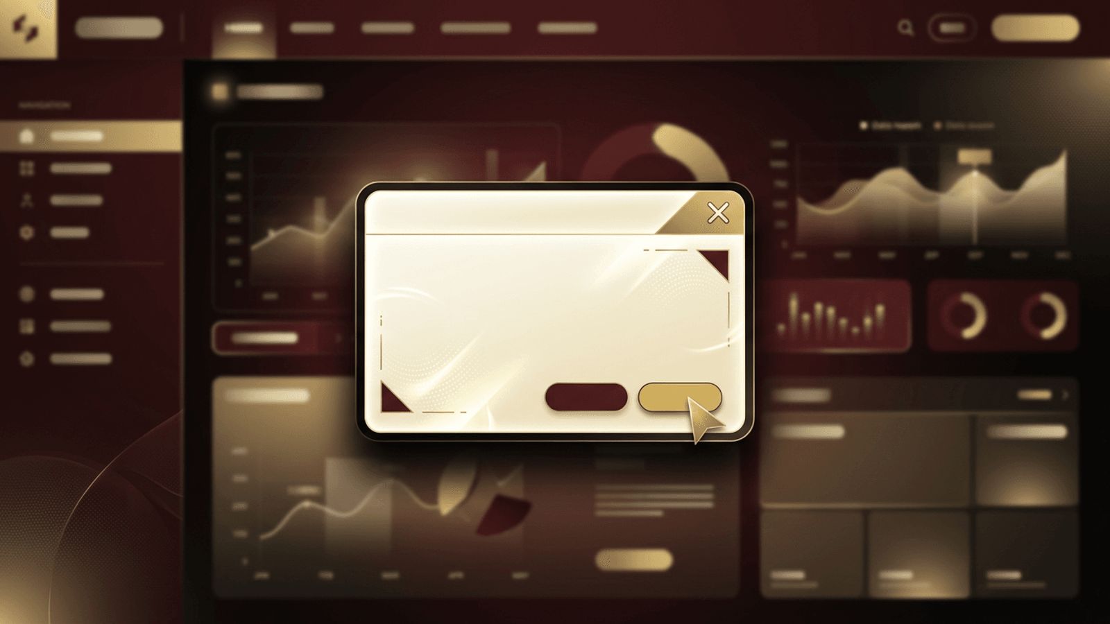
If you have ever seen a window pop up in the middle of a web page asking you to confirm an action, sign in, or subscribe to a newsletter, you have encountered a modal. Modals are one of the most common interface patterns in web design, and when used thoughtfully, they can improve user experience by focusing attention on important tasks. When misused, however, they can frustrate users and harm conversions. This article explains what a modal is in web design, how modals work, when to use them, and how to design them effectively.
Thoughtful Interface Design by AAMAX.CO
Designing interface elements like modals requires a deep understanding of user behavior. AAMAX.CO is a full-service digital marketing company that offers web development, digital marketing, and SEO services worldwide. Their designers and developers create user-friendly interfaces where every interactive element, including dialogs, forms, and navigation, is purposeful and accessible. They carefully consider when a modal helps users and when another pattern would work better. By combining usability principles with conversion-focused strategy, they build websites that guide visitors smoothly toward their goals without unnecessary friction.
What Is a Modal?
A modal, also called a modal window or modal dialog, is a user interface element that appears on top of the main content of a page. When a modal is open, it typically disables interaction with the rest of the page until the user completes an action or closes the modal. The background is often dimmed with a semi-transparent overlay to draw attention to the modal's content. The term "modal" comes from the idea that the interface enters a special mode that requires user attention.
Modal Versus Non-Modal Elements
It is important to distinguish modals from non-modal elements. A non-modal element, such as a tooltip, toast notification, or side panel, allows users to continue interacting with the page while it is visible. A modal interrupts the user's flow and requires a response. Because of this interruption, modals should be reserved for situations where focused attention is genuinely necessary.
Common Types of Modals
Modals come in several forms. Confirmation modals ask users to confirm important or destructive actions, such as deleting data. Form modals collect information, such as login details or contact information, without navigating away from the current page. Informational modals display important messages, terms, or announcements. Media modals, often called lightboxes, display enlarged images or videos. Promotional modals present offers or newsletter sign-ups, though these must be used carefully to avoid annoying visitors.
When to Use a Modal
Modals work best when users need to make a decision or complete a short task without losing context. Examples include confirming a purchase, editing a single item in a list, or viewing a larger version of an image. They are effective when the task is brief and directly related to the current page. If the content is lengthy or complex, a dedicated page is usually a better choice.
When to Avoid Modals
Avoid using modals for content that users might need to reference while interacting with the page. Do not display modals immediately upon page load unless absolutely necessary, as this can feel intrusive. Excessive promotional pop-ups can damage user trust and may negatively affect search engine rankings on mobile devices. Never stack multiple modals on top of each other, as this creates confusion and poor usability.
Best Practices for Modal Design
Keep modal content concise and focused on a single purpose. Use a clear title that explains why the modal appeared. Provide obvious actions, such as a primary button for the main action and a secondary option to cancel. Always include a visible close button, and allow users to dismiss the modal by pressing the Escape key or clicking outside it when appropriate. Ensure the modal is responsive and fits comfortably on small screens. Professional website design applies these principles consistently to create interfaces that feel natural.
Accessibility Considerations
Accessible modals are essential for users who rely on keyboards or assistive technologies. When a modal opens, keyboard focus should move into it, and focus should be trapped within the modal until it closes. When it closes, focus should return to the element that opened it. Use appropriate dialog roles and attributes so screen readers announce the modal correctly, and give the modal an accessible label. Ensure sufficient color contrast and readable text sizes.
Performance and Technical Considerations
Modals should open and close smoothly without noticeable delays. Avoid loading heavy content until the modal is actually opened. Prevent the background page from scrolling while the modal is active, and restore the scroll position when it closes. Modern HTML now includes a native dialog element that simplifies building accessible modals, and many component libraries provide well-tested modal components.
Measuring Modal Effectiveness
If you use modals for conversions, such as email sign-ups, track their performance. Measure how often they are displayed, how many users interact with them, and how many dismiss them immediately. Test different timing, triggers, and content to find what works best without harming the overall user experience.
Conclusion
Understanding what a modal is in web design helps you use this powerful pattern responsibly. Modals are ideal for focused tasks, confirmations, and short interactions, but they should never interrupt users unnecessarily. By keeping them concise, accessible, responsive, and purposeful, you can create modals that enhance usability rather than detract from it.
