

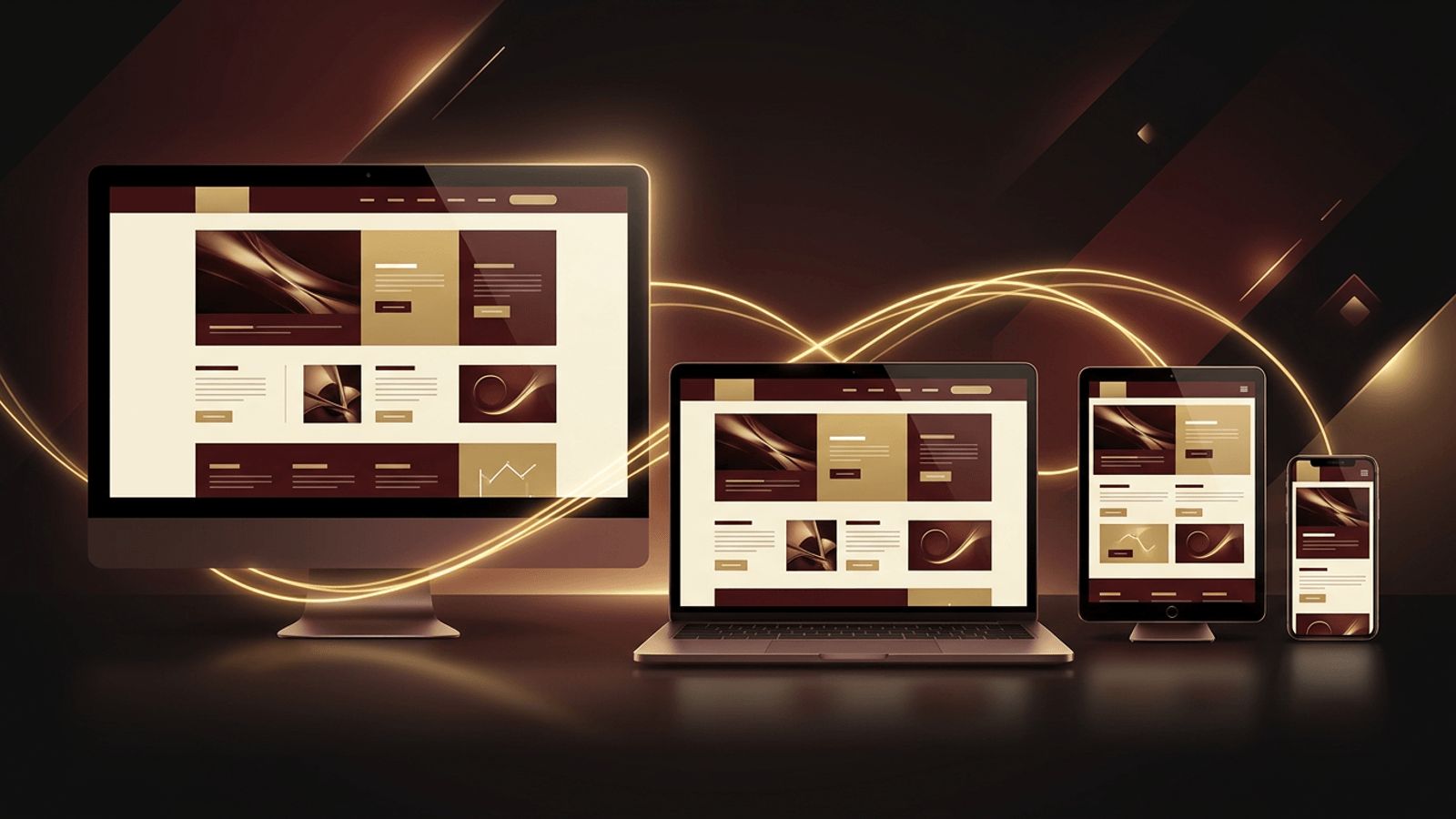
People visit websites on an incredible variety of devices: smartphones, tablets, laptops, desktop monitors, and even smart TVs. Each device has a different screen size, resolution, and method of interaction. Building a separate website for each one would be impractical, which is why responsive web design has become the standard approach in modern web development. Responsive design ensures that a single website automatically adapts its layout, images, and content to provide an optimal experience on any screen. In this article, we explain what responsive web design is, how it works, its core principles, and why it is essential for businesses today.
AAMAX.CO: Building Websites That Look Perfect Everywhere
Creating a truly responsive experience requires careful planning, design, and development, and AAMAX.CO specializes in exactly that. They are a full-service digital marketing company offering web development, digital marketing, and SEO services worldwide. Their website design team uses a mobile-first methodology to create layouts that flow naturally across phones, tablets, and desktops. Their developers implement flexible grids, optimized images, and touch-friendly interactions, then test extensively on real devices. Because responsive design directly affects SEO and conversions, they ensure every site delivers speed, usability, and visual consistency regardless of how visitors access it.
Defining Responsive Web Design
Responsive web design is an approach in which a website's layout and content adjust dynamically based on the size and capabilities of the user's device. Instead of creating fixed-width pages, designers and developers use flexible layouts, scalable images, and CSS media queries so that the website responds to its environment. The term was popularized by web designer Ethan Marcotte in 2010, and it quickly became a cornerstone of modern web design.
How Responsive Design Works
Fluid Grids
Rather than defining layouts in fixed pixel widths, responsive designs use relative units such as percentages, fractions, and viewport units. This allows columns and containers to stretch or shrink proportionally as the screen size changes.
Flexible Images and Media
Images and videos are styled to scale within their containers, preventing them from overflowing on small screens. Techniques like responsive image attributes allow browsers to download appropriately sized images for each device, saving bandwidth.
Media Queries
CSS media queries apply different styles depending on characteristics such as screen width, orientation, or resolution. For example, a three-column layout on desktop might become a single column on a smartphone.
Breakpoints
Breakpoints are the specific screen widths at which the layout changes. Designers choose breakpoints based on where the content naturally needs to adapt, rather than targeting specific devices.
Modern Layout Tools
CSS Flexbox and Grid make it easier than ever to build adaptive layouts. Container queries, a newer feature, allow components to respond to the size of their parent container rather than the entire viewport.
Mobile-First Design
Mobile-first is a strategy in which designers start with the smallest screen and progressively enhance the layout for larger devices. This approach forces teams to prioritize essential content and features, resulting in cleaner, faster experiences. It also aligns with how search engines evaluate websites, since mobile versions are used as the primary basis for indexing and ranking.
Why Responsive Web Design Matters
Improved User Experience
Visitors can read content, navigate menus, and complete actions easily without zooming or horizontal scrolling. A seamless experience keeps users engaged and builds trust.
Better SEO Performance
Search engines favor mobile-friendly websites. Responsive design also consolidates content under a single URL, avoiding duplicate content issues associated with separate mobile sites.
Higher Conversion Rates
When forms, buttons, and checkout processes work smoothly on every device, more visitors complete purchases or inquiries.
Cost Efficiency
Maintaining one responsive website is far more economical than managing separate desktop and mobile versions.
Future-Proofing
New devices with different screen sizes appear constantly. Responsive design adapts automatically, reducing the need for future redesigns.
Responsive Versus Adaptive Design
Adaptive design uses several fixed layouts tailored to specific screen sizes, serving the closest match to each device. Responsive design, by contrast, uses fluid layouts that adjust continuously. Responsive design is generally more flexible and easier to maintain, which is why it has become the preferred approach.
Best Practices for Responsive Web Design
- Include the viewport meta tag so browsers scale pages correctly.
- Design with a mobile-first mindset and prioritize key content.
- Use relative units for layouts, spacing, and typography.
- Make touch targets large enough for fingers, with sufficient spacing.
- Optimize images with modern formats and responsive sizing.
- Simplify navigation on small screens with collapsible menus.
- Test on real devices, not just browser emulators.
- Ensure text remains readable without zooming.
Common Responsive Design Mistakes
Common mistakes include hiding important content on mobile devices, using fixed-width elements that cause horizontal scrolling, loading oversized images on small screens, placing clickable elements too close together, and neglecting performance on slower mobile networks. Avoiding these pitfalls ensures a consistent, high-quality experience for all users.
Testing Responsive Websites
Thorough testing is essential. Developers use browser developer tools to simulate different screen sizes, but real-device testing reveals issues with touch interactions, performance, and rendering. Tools that measure page speed and mobile usability help identify areas for improvement.
Final Thoughts
Responsive web design is no longer optional; it is a fundamental requirement for any successful website. By using fluid grids, flexible media, and thoughtful breakpoints, responsive design ensures that every visitor enjoys a seamless experience regardless of their device. For businesses, it means stronger SEO, higher conversions, lower maintenance costs, and a website that is ready for whatever devices the future brings.
