

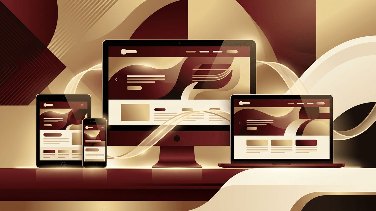
Not long ago, most people accessed the internet from a desktop computer. Today, the same person might discover your business on a smartphone during their commute, research it on a tablet at lunch, and make a purchase on a laptop in the evening. Each of these devices has a different screen size, resolution, and method of interaction. Responsive web design is the approach that allows a single website to automatically adapt its layout, images, and content to fit any screen. It has moved from being a nice-to-have feature to an absolute necessity. Understanding why responsive design is important can help businesses deliver better experiences and stay competitive online.
How AAMAX.CO Creates Responsive Websites That Perform
Building a website that looks and works flawlessly on every device requires both design skill and technical precision. AAMAX.CO is a full-service digital marketing company offering web development, digital marketing, and SEO services worldwide. Their website design team creates mobile-first layouts that adapt seamlessly to phones, tablets, and desktops, while their developers ensure fast performance and smooth interactions on every screen. Because they understand how responsiveness affects search rankings and conversions, they build sites that are not only beautiful but also optimized to grow a business.
What Is Responsive Web Design?
Responsive web design uses flexible grids, fluid images, and CSS media queries to adjust a website's layout based on the size of the viewing screen. Instead of building separate websites for mobile and desktop users, a responsive site uses one codebase that rearranges itself intelligently. Navigation menus may collapse into a compact icon, columns may stack vertically, images may resize, and font sizes may adjust for readability. The result is a consistent, user-friendly experience no matter how visitors access the site.
Mobile Traffic Dominates the Web
More than half of global web traffic now comes from mobile devices, and in many industries that number is even higher. Restaurants, local services, retail, and entertainment businesses often see the majority of their visitors arriving on phones. If a website is difficult to read or navigate on a small screen, those visitors will leave quickly and likely choose a competitor. Responsive design ensures you capture and retain this enormous mobile audience.
Better User Experience
Users expect websites to be easy to use. On a non-responsive site, mobile visitors must pinch, zoom, and scroll sideways just to read text or tap a tiny button. This frustration damages your brand and reduces engagement. Responsive design eliminates these problems by presenting content in a format that fits naturally on each device. Buttons become large enough to tap, text remains readable without zooming, and menus are simple to navigate with a thumb.
Responsive Design Improves SEO
Google uses mobile-first indexing, which means it primarily evaluates the mobile version of a website when determining rankings. A site that performs poorly on mobile devices can struggle to rank, even for desktop searches. Responsive design supports SEO in several ways:
- It meets Google's mobile-friendly expectations
- It keeps all content on a single URL, consolidating link authority
- It reduces bounce rates by providing a better experience
- It avoids duplicate content issues created by separate mobile sites
- It improves page speed when combined with optimized images and code
Higher Conversion Rates
Whether your goal is generating leads, booking appointments, or selling products, responsive design helps more visitors complete those actions. Mobile users who encounter clunky forms or hidden checkout buttons often abandon the process. When forms, product pages, and calls to action are optimized for every screen, conversions increase. Businesses frequently see measurable growth in sales and inquiries after switching to a responsive design.
Faster Loading Times
Responsive websites can be optimized to serve appropriately sized images and resources for each device. This means mobile users do not have to download huge desktop images over slower connections. Faster loading times keep visitors engaged, improve satisfaction, and contribute to better search rankings, since page speed is a known ranking factor.
Cost-Effective and Easier to Maintain
Maintaining separate desktop and mobile websites doubles the work and expense. Every content update, design change, or bug fix must be made twice. Responsive design uses a single website for all devices, which simplifies management, reduces development costs, and ensures consistency. Marketing teams can update content once and know it will display correctly everywhere.
Consistent Branding Across Devices
Your brand should look and feel the same whether someone visits on a phone or a widescreen monitor. Responsive design maintains consistent colors, typography, imagery, and messaging across all screen sizes. This consistency builds recognition and trust, reinforcing your brand identity with every interaction.
Future-Proofing Your Website
New devices with different screen sizes appear constantly, from foldable phones to smart TVs and in-car displays. Because responsive design relies on flexible layouts rather than fixed dimensions, it adapts to new devices without requiring a complete redesign. This makes your website more resilient and extends its useful lifespan.
Better Social Media and Email Performance
Most people open social media links and marketing emails on their phones. If your campaigns send traffic to a website that is not mobile-friendly, much of your marketing investment is wasted. A responsive site ensures that visitors arriving from social posts, ads, and newsletters enjoy a smooth experience that encourages them to take action.
Conclusion
Responsive web design is important because it delivers an excellent experience on every device, supports strong SEO, increases conversions, reduces maintenance costs, and prepares your website for the future. In a world where customers move constantly between screens, a responsive website is no longer optional. It is the foundation of a modern, effective online presence that helps businesses reach and convert their audience wherever they are.
